
Figures without context
Connect each market figureto a useful comparison.
A digital market experience that gives dense information a distinctive visual direction. Navigation, content and interactive details help people explore with a clear point of reference.
Who the experience serves, the environment it operates in and the design work included.
Invite exploration of digital assets, with clear limits around illustrative data.
Connect each market figureto a useful comparison.
Explain abstract conceptsthrough understandable tools.
Label sample functionalityapart from live transactions.
Design ObjectiveConnect a distinctive digital identity with understandable sample-data tools and a clear information hierarchy.
Clearer journeys bring useful information and important actions into focus.
Compare sample prices and market trends. Keep the information easy to scan.
The market view groups sample prices, trends and comparisons in a readable interface.
Connect the website promise with benefits. Give visitors a clear place to begin.
The introduction connects the website’s promise with a small set of understandable benefits.
Explore sample calculations and allocations. Keep educational context close by.
The sample calculator and allocation view present educational interactions with clear context.
Read short guidance in a clear sequence. Make financial habits easier to explore.
The habits view uses short guidance and a clear sequence to make the reading approachable.
Find answers beside the next action. Connect useful context with a clear route.
The questions and closing section connect supporting information with a clear next step.
Bring the offer and learning tools together. Keep a consistent visual language.
The complete website connects the offer, market context and learning tools through a consistent visual language.
These are design intentions. The benefits below are not presented as measured outcomes.
Bring comparison and timeframe controls into the market-information design. Help visitors read figures with a frame of reference.
Explain sample prices and exclusions such as fees and spreads around the converter. Make the limits of the demo easier to recognise.
Connect proportions and amounts and explain the fixed split rule. Explain the learning tool without giving investment advice.
Use visual explanations and a safety checklist within a responsive hierarchy. Make unfamiliar concepts easier to explore.
Shared components, type and interaction patterns keep the product consistent.
Related actions and interface elements follow a familiar structure.
Consistent hierarchy gives dense and quiet screens a shared rhythm.
Clear selections and feedback support predictable next steps.
Explore the design deliverables. Intended benefits are not measured results.
Landing-page introduction.
View screensMarket information and trends.
View screensIllustrative learning tools.
View screensSupporting guidance and answers.
View screensThe outcomes shown describe the design and prototype. Figures and tools are illustrative; no live trading, financial performance or measured conversion outcomes are claimed.
Tell us what your users are struggling with, and we’ll help you explore a practical way forward.
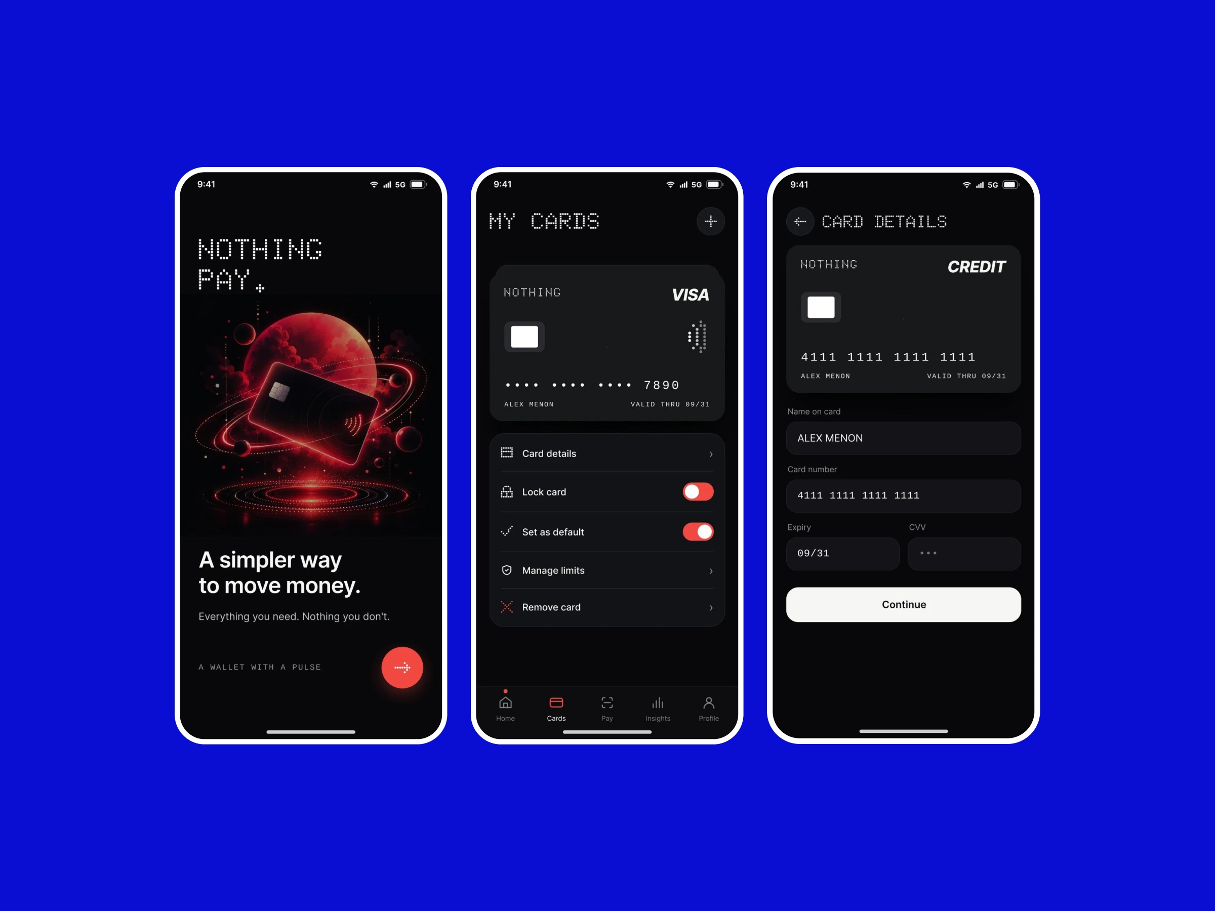
A concept bringing everyday payments, linked accounts and transaction context into a focused mobile experience.
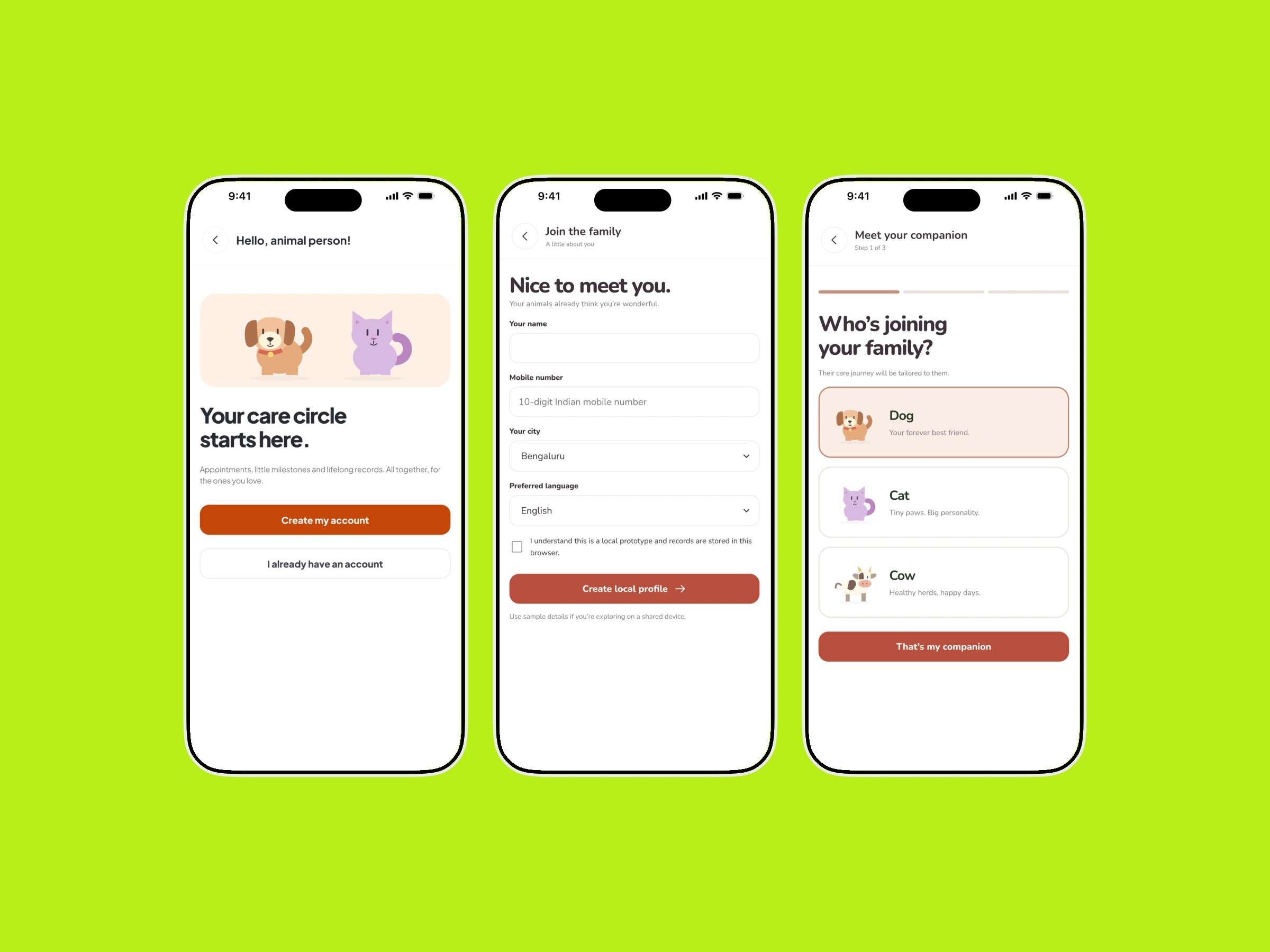
Profiles, health records and care services arranged around the needs of pet parents and cattle caregivers.