
Ambiguous selection
Show the selected cardand its controls clearly.
An independent Nothing ecosystem concept examining everyday payment tasks. The design brings payment actions, linked accounts and transaction context into a focused mobile flow.
Who the experience serves, the environment it operates in and the design work included.
Make card selection, payment steps and completion clear in one focused concept.
Show the selected cardand its controls clearly.
Make review and completionfeel like distinct steps.
Connect spending totalsto a period and categories.
Design ObjectiveExplore a coherent wallet interface with clear selection, review and completion states.
Clearer journeys bring useful information and important actions into focus.
Selected cards stay clear and easy to manage. Key controls sit beside the details.
Card management presents the selected card, readable details and direct controls in a focused view. These are interface demonstrations rather than live banking actions.
Selection, scanning and review stay connected. Each step explains what happens next.
The payment exploration shows selection, scanning and review states, with primary actions designed to explain the next step.
Add a card, check its type and review details. The default-card setting stays visible.
Card entry leads into a review that distinguishes credit and debit types and shows the default-card setting.
Compare spending by period and category. Totals and changes share one clear view.
The insights screens connect a selected period with a spending total, comparison and category breakdown.
Cards, shortcuts and activity come together. Everyday actions have a familiar home.
The home view brings the selected card, payment shortcuts and recent transactions into one familiar starting point.
Amounts, dates and updates stay connected. Each transaction keeps its context.
Transaction history and notifications show amounts, dates and the context behind each update.
An interaction demonstration from the independent concept.
These are design intentions. The benefits below are not presented as measured outcomes.
Keep the selected card prominent with readable last digits and nearby controls. Make the payment source easier to recognise.
Use distinct review and completion feedback rather than relying on decoration. Show which stage the interaction has reached.
Connect totals to time periods, comparisons and categories. Give spending figures a useful frame of reference.
Tie movement to card selection, verification and completion states. Support feedback with motion and clear written information.
Shared components, type and interaction patterns keep the product consistent.
Related actions and interface elements follow a familiar structure.
Consistent hierarchy gives dense and quiet screens a shared rhythm.
Clear selections and feedback support predictable next steps.
Explore the design deliverables. Intended benefits are not measured results.
Home and card-management views.
View screensPayment preparation and review states.
View screensCard-entry and review patterns.
View screensSpending insights and profile.
View screensNothing Pay is an independent concept. Payment, bank-linking and security interactions are demonstrations. No production payment capability, usability results or measured business impact are claimed.
Tell us what your users are struggling with, and we’ll help you explore a practical way forward.
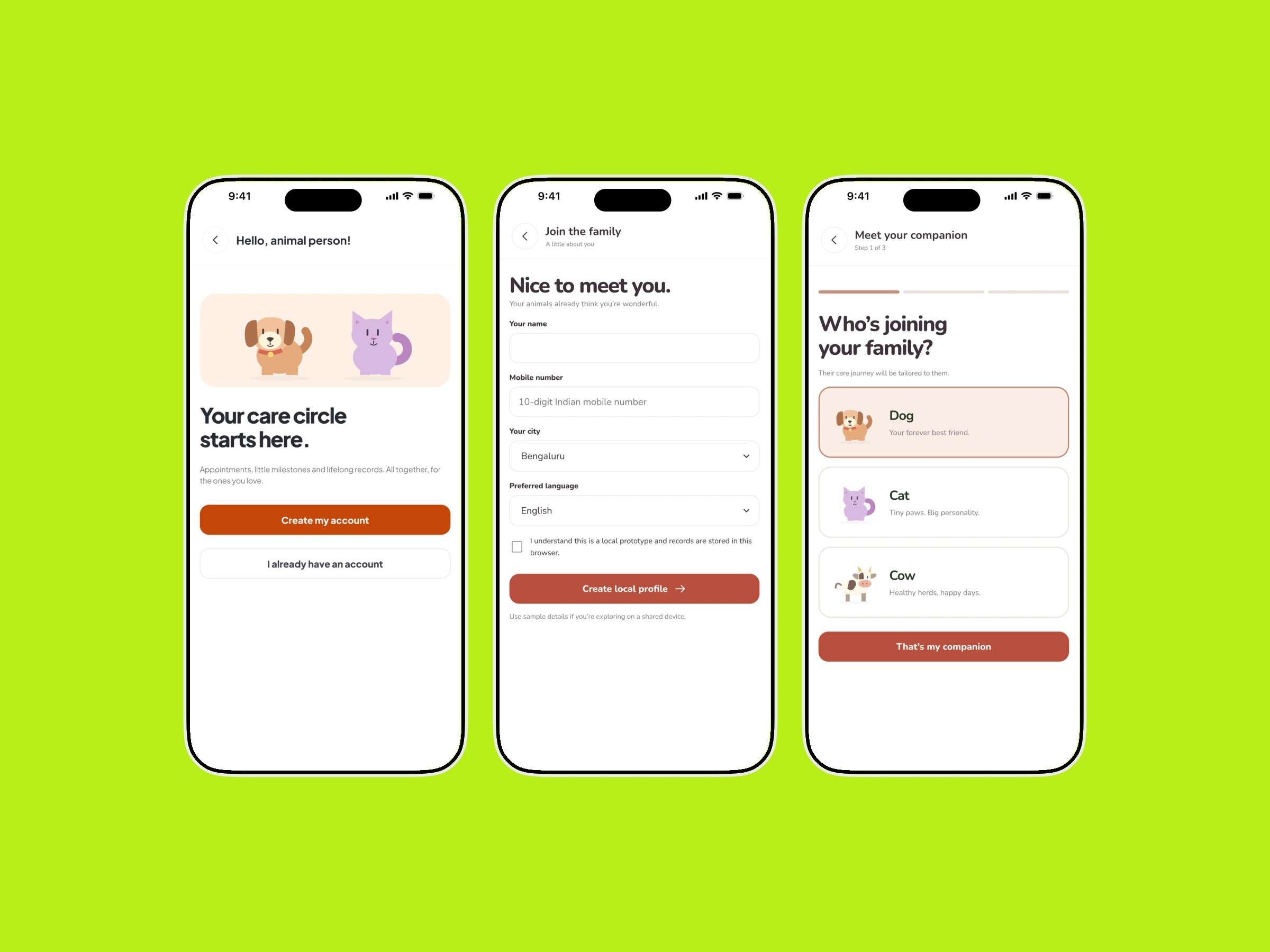
Profiles, health records and care services arranged around the needs of pet parents and cattle caregivers.
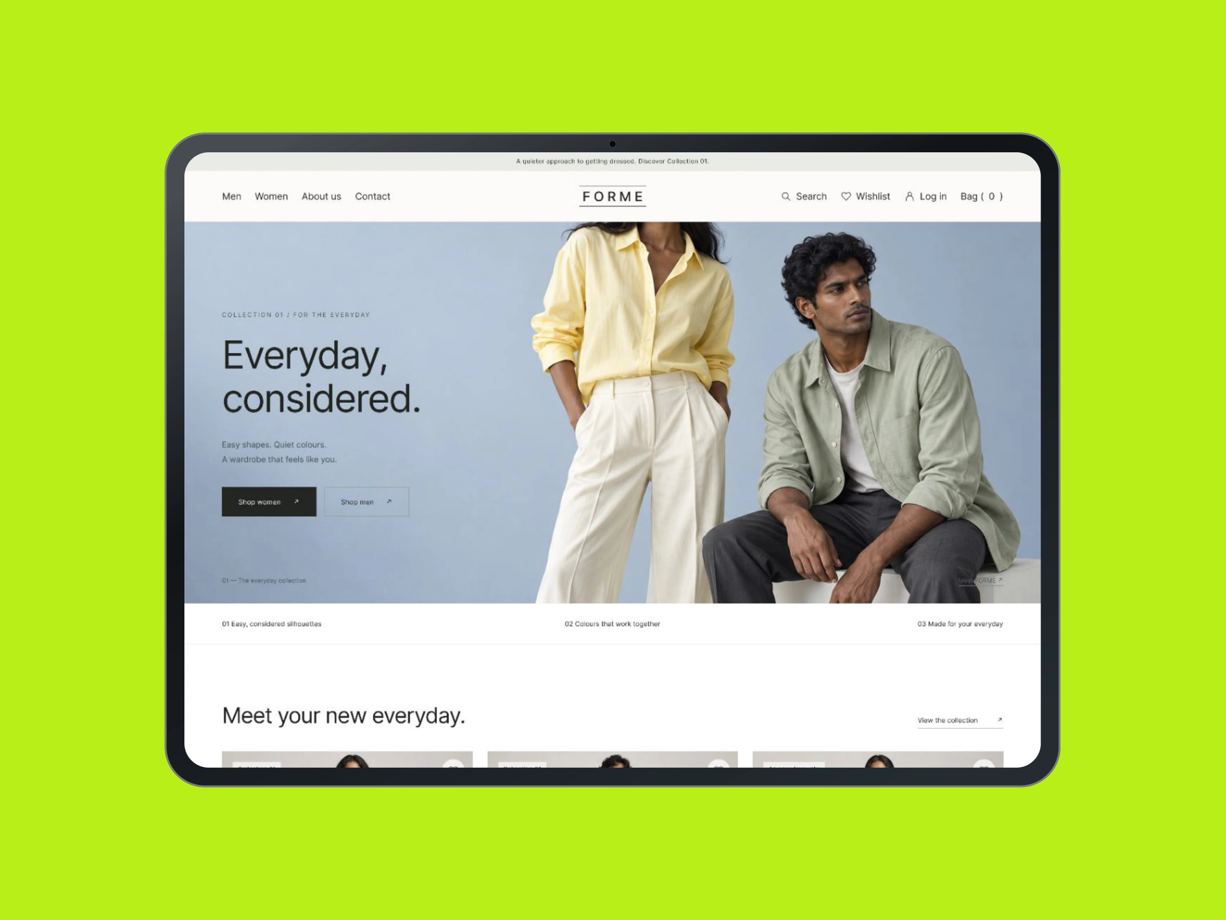
A fashion storefront concept connecting collections, product details and purchase actions in a considered shopping journey.