
Discovery without direction
Give collection discoverya clear place to begin.
A fashion storefront concept bringing product discovery and brand expression together. The shopping experience keeps collections, product detail and purchase actions connected.
Who the experience serves, the environment it operates in and the design work included.
Let the collection’s character guide discovery, without obscuring the next step.
Give collection discoverya clear place to begin.
Balance expressive imagerywith practical product detail.
Connect every pagethrough one visual language.
Design ObjectiveBalance editorial expression with a consistent hierarchy for collection discovery and product consideration.
Clearer journeys bring useful information and important actions into focus.
Connect editorial imagery with collections. Give visitors a clear route to explore.
A clear landing page connects the editorial imagery with collection discovery.
Introduce the brand’s point of view. Let the story breathe in a quieter layout.
The about page introduces the brand perspective in a quieter editorial layout.
Keep product, price and action together. Make the shopping hierarchy clear.
The product view places the item, price and next action in a clear shopping hierarchy.
Bring products and discovery together. Keep browsing consistent and familiar.
The collection grid brings product cards and discovery controls into a consistent browsing view.
Explain the empty bag in plain language. Offer a clear route back to shopping.
The supplied empty-bag screen gives the visitor a clear state and a route back to the collection.
Pair common questions with an enquiry. Keep the next conversation easy to start.
The contact page pairs common questions with a focused enquiry form.
These are design intentions. The benefits below are not presented as measured outcomes.
Lead with Men and Women, then support the collection with category, size and sort controls. Give shoppers a familiar way to narrow their selection.
Place fit, fabric, care and delivery information near selection controls in the design scope. Answer the questions behind a product decision.
Use clear size feedback and useful wishlist empty-state copy. Make the next action easier to understand.
Rebalance content for desktop and mobile while repeating navigation and action patterns. Keep a familiar experience as the layout changes.
Shared components, type and interaction patterns keep the product consistent.
Related actions and interface elements follow a familiar structure.
Consistent hierarchy gives dense and quiet screens a shared rhythm.
Clear selections and feedback support predictable next steps.
Explore the design deliverables. Intended benefits are not measured results.
Campaign-led homepage.
View screensFocused product detail.
View screensCollection discovery.
View screensConnected shopping states.
View screensThe outcomes describe the design delivered. Live business impact has not yet been measured.
Tell us what your users are struggling with, and we’ll help you explore a practical way forward.
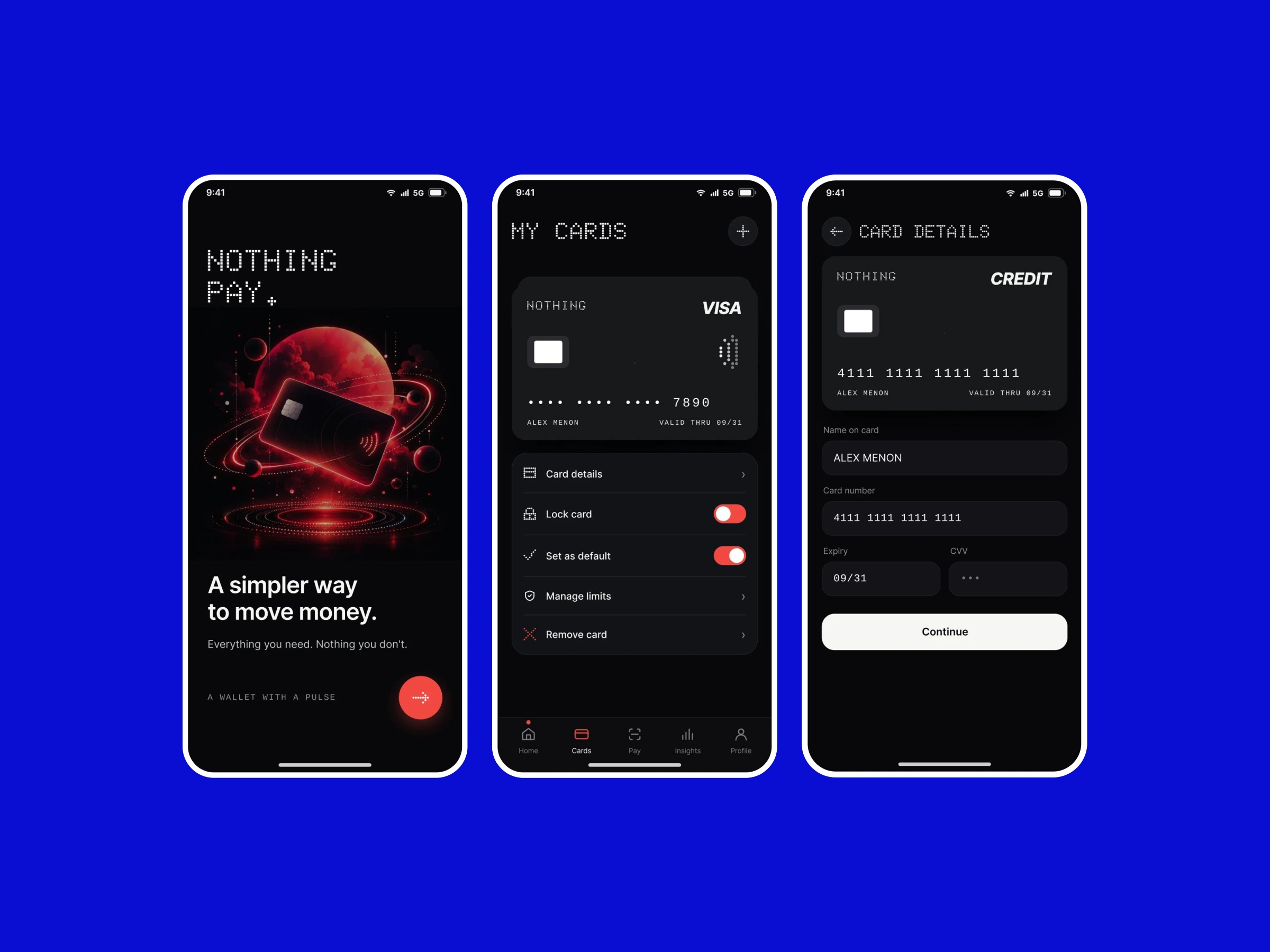
A concept bringing everyday payments, linked accounts and transaction context into a focused mobile experience.
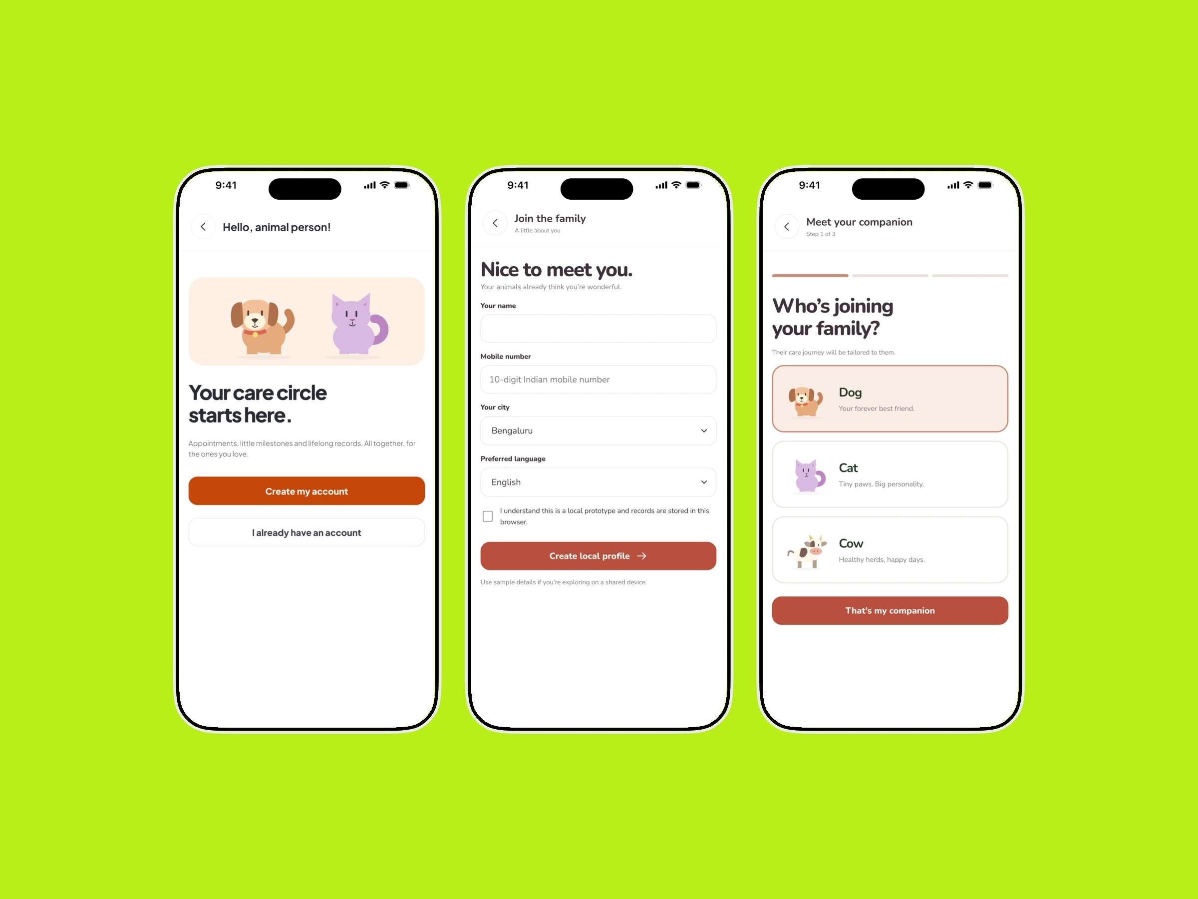
Profiles, health records and care services arranged around the needs of pet parents and cattle caregivers.