
Product recognition
Recognise similar bottleswith clear visual stock cues.
An inventory dashboard designed for the daily work behind stock management. Overview, product and reporting screens connect visibility with the next operational action.
Who the experience serves, the environment it operates in and the design work included.
Keep products, stock quantities and replenishment needs easy to compare.
Recognise similar bottleswith clear visual stock cues.
Keep quantity and pricingclose to each product.
Separate planned top-upsfrom orders sent to suppliers.
Design ObjectiveConnect product recognition, stock comparison and replenishment context in one operational workspace.
Clearer journeys bring useful information and important actions into focus.
See stock summaries beside product cards. Keep low-stock context close at hand.
The supplied workspace view combines summary information, recognisable product cards and low-stock context. It gives the team one starting point for reviewing the shift.
Connect stock value and bottle counts. Compare categories from one overview.
The reporting view connects stock value, bottle counts and category comparisons in one overview.
Review stock and expected deliveries. Plan the remaining need before ordering.
Low-stock planning brings on-hand quantities, expected deliveries and existing drafts into the same comparison.
Keep draft actions beside each product. See the remaining need in context.
The supplied replenishment view keeps the remaining need and the draft action beside each product.
Browse bottles, stock and categories. Keep inventory details easy to recognise.
The inventory page combines recognisable bottles, stock details and category controls in a product-led overview.
Connect stock, overview and replenishment. Use familiar navigation throughout.
A shared navigation and visual system connect the daily overview, stock catalogue and replenishment views.
These are design intentions. The benefits below are not presented as measured outcomes.
Use category names, subtype chips and bottle photography together. Recognise the product before reading the details.
Keep quantity, location, purchase price and selling price on the product card. Compare key stock details in one familiar place.
Distinguish on-hand stock from quantities already covered by expected deliveries. See outstanding needs beside incoming stock.
Label the intermediate action as Create Draft and explain what it does. Keep stock planning distinct from sending a supplier order.
Shared components, type and interaction patterns keep the product consistent.
Related actions and interface elements follow a familiar structure.
Consistent hierarchy gives dense and quiet screens a shared rhythm.
Clear selections and feedback support predictable next steps.
Explore the design deliverables. Intended benefits are not measured results.
Stock-management overview.
View screensStock insights and reporting.
View screensLow-stock planning.
View screensReplenishment context.
View screensTell us what your users are struggling with, and we’ll help you explore a practical way forward.
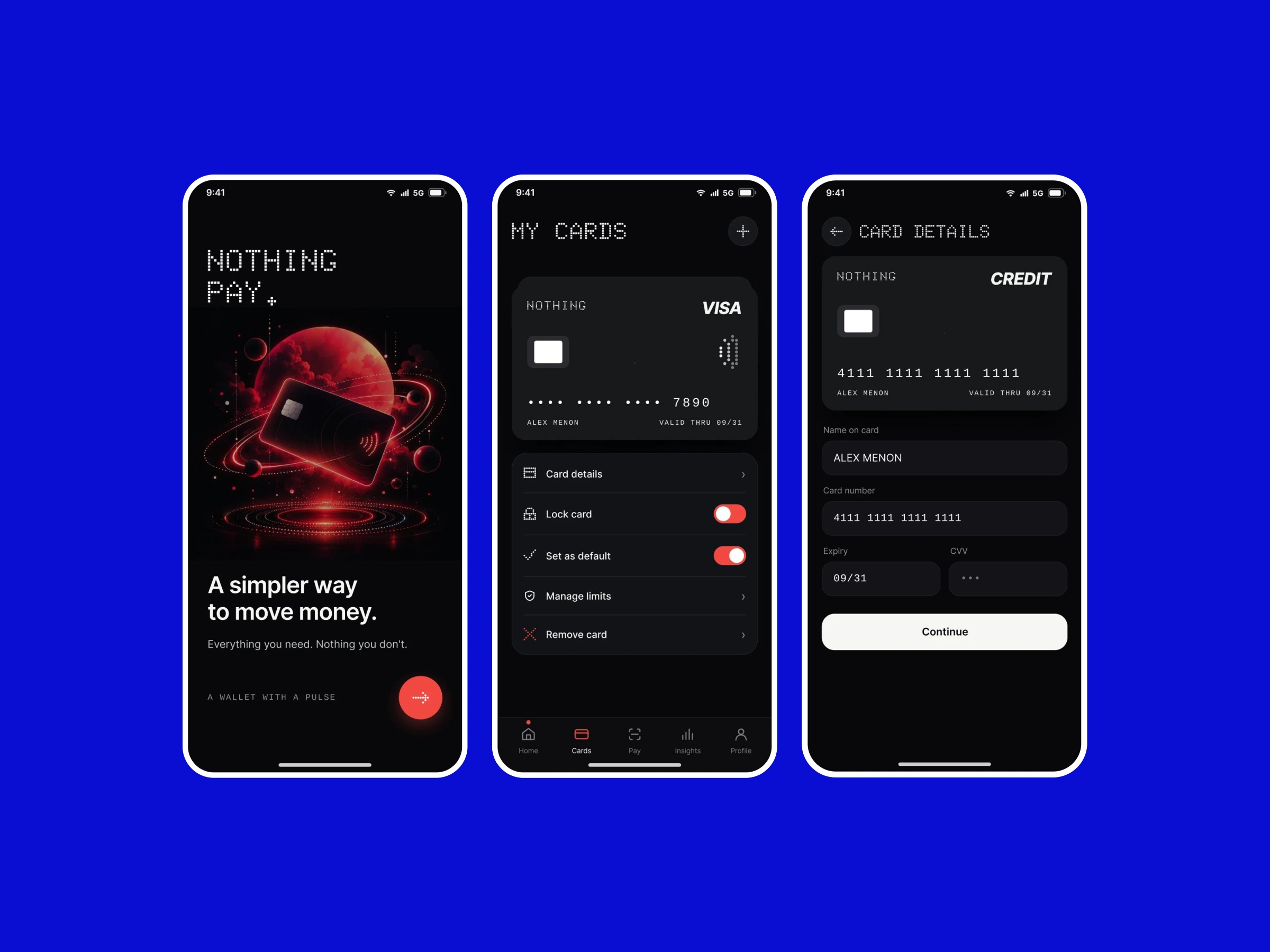
A concept bringing everyday payments, linked accounts and transaction context into a focused mobile experience.
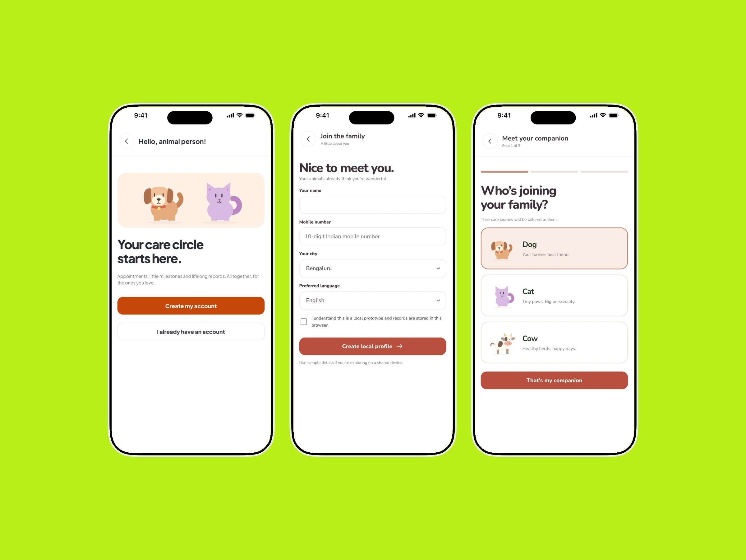
Profiles, health records and care services arranged around the needs of pet parents and cattle caregivers.