
Atmosphere without answers
Property imagery can create interest. Buyers still need a clear picture of space, layout and daily life.
Avenor brings architectural character and practical property information into one considered website. Visitors can explore the residence, compare floor levels and start a viewing conversation without losing their place.
The audience, property context and work behind Avenor’s digital presence.
The design challenge was to connect the feeling of a home with the information people need before arranging a visit.
Property imagery can create interest. Buyers still need a clear picture of space, layout and daily life.
Floor areas, amenities and neighbourhood context should feel like parts of one property story.
Visitors need room to explore before a viewing request feels like the natural next step.
Design ObjectiveBring atmosphere, property detail and a clear route to a private viewing into one continuous journey.
Six moments connect the architecture, the practical details and the invitation to enquire.
The opening pairs a clear promise with moving architecture. A direct action takes visitors into the residence story.
The building movement and single brand reveal establish character before the page shifts into practical information.
Interior photography sits beside bedroom, bathroom and floor-area information, keeping the essentials within the same view.
A concise fact panel helps visitors connect the room imagery with the scale and arrangement of the residence.
Living, private, wellness and rooftop tabs reveal the plan and key details for each level.
The selected tab, plan drawing and area information change together, so the visitor always knows which floor they are exploring.
Lifestyle photography and short editorial moments show how the spaces could feel across ordinary days.
A consistent property image set connects interiors, shared spaces and quieter moments without changing the visual tone.
The hierarchy adapts across desktop, tablet and mobile, with readable content and accessible routes to property details.
Navigation condenses on mobile while the residence story and enquiry route stay available within a single page.
A compact form gathers contact details, property interest and a message before the visitor reviews their enquiry.
The front-end enquiry interaction supports review and editing. It presents the information needed for a property conversation without implying a confirmed booking.
Each choice supports a specific step in the property exploration journey.
Keep the essential residence details beside the photography, so visitors can connect an impression with something concrete.
A viewing action in the shared header gives visitors a consistent route to the enquiry section as their interest develops.
The opening uses movement to introduce the property. The following sections return to a calmer pace for reading and comparison.
One set of level tabs changes the drawing and its supporting details together, reducing the need to remember information between views.
Typography, colour and shared controls give Avenor a consistent character from the first screen to the enquiry form.
Manrope gives property information clarity. Instrument Serif adds a quieter editorial accent to selected headings.
Deep green, warm off-white and restrained earthy accents echo the material character of the interiors.
Buttons, tabs, content labels and form fields share a consistent language across the page.
A connected set of design and front-end deliverables, from the opening sequence to the viewing enquiry.
An animated homepage opening and residence discovery route.
View screensProperty facts connected with interior photography.
View screensInteractive living, private, wellness and rooftop views.
View screensContact fields, property interest, review and editing.
View screensThis portfolio project demonstrates the design and front-end experience. The enquiry interaction is a prototype; no confirmed bookings, sales results or measured conversion improvements are claimed.
Let’s shape a website that gives people the detail and confidence to begin a conversation about your property.
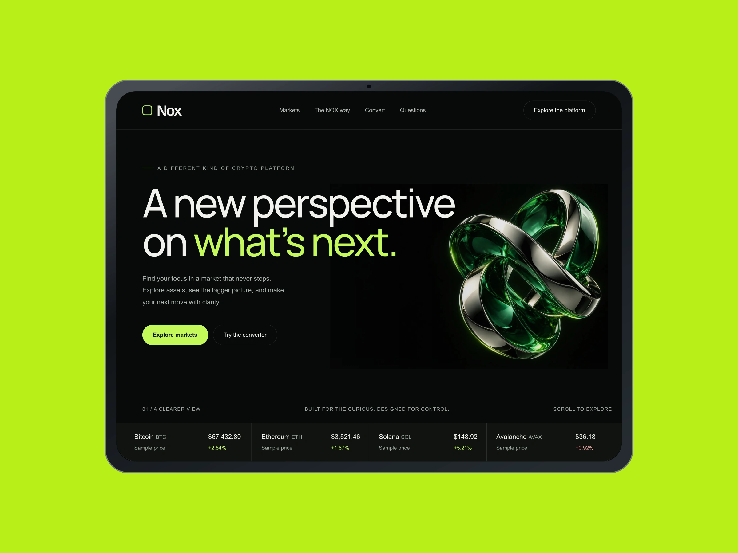
A market-focused digital experience balancing an expressive identity with structured information and interactive exploration.
Explore Case Study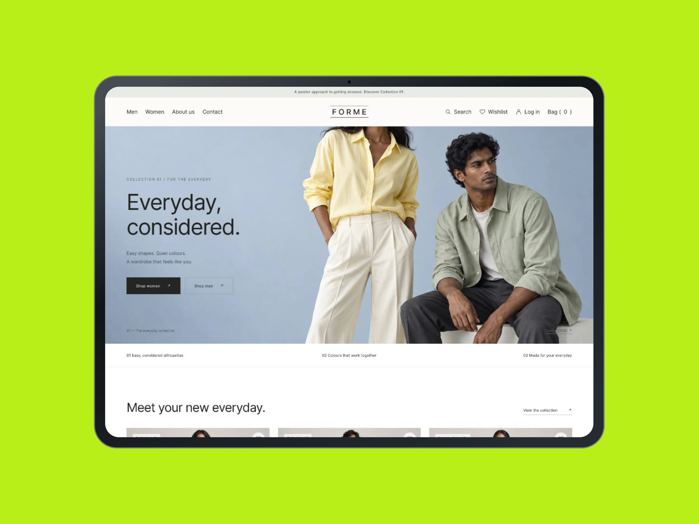
A fashion storefront concept connecting collections, product details and purchase actions in a considered shopping journey.
Explore Case Study