
Too many places to begin
Specialties, doctors, check-ups and visit details need distinct routes without competing for attention.
A welcoming hospital homepage that connects people with the right specialty, a relevant doctor and the information they need before a visit. Clear choices, calm visuals and practical guidance support every next step.
The audience, focus and scope behind Aariva’s homepage.
The design challenge was to make a complex set of hospital information feel manageable, especially for someone arriving with questions.
Specialties, doctors, check-ups and visit details need distinct routes without competing for attention.
A hospital can communicate capability while still sounding approachable to patients and their families.
Practical questions about preparation, insurance and follow-up deserve space alongside clinical discovery.
Design ObjectiveConnect reassurance, relevant information and a clear next action within one patient-first homepage.
A clear introduction leads into specialty discovery, doctor exploration and practical support for the visit.
A full-width family photograph makes the opening feel personal. Two navigation rows separate utility tasks from care discovery, with a direct appointment action.
Give the primary tasks a stable place. The quick-action row connects doctor search, check-ups and visit preparation without requiring a deep menu search.
Eight specialty cards pair plain-language descriptions with dimensional medical illustrations. A filled blue hover state gives each interactive card a clear response.
Keep the label, short explanation and action together. Repeated card proportions make the options easier to compare.
Search, specialty filters and consistent profile cards bring names, areas of care and appointment actions into a familiar browsing pattern.
Use one predictable card structure, with room for portraits and a clearly separated profile link and appointment control.
A visit companion groups preparation, insurance and follow-up information into three tabs. A visible selected state and numbered guidance help visitors stay oriented.
Separate each stage of the visit while keeping the guidance in one compact space. Familiar tabs let people revisit the information they need.
Every choice supports a practical task while giving the hospital a warm, recognisable visual identity.
Utility actions sit above care navigation. Specialty discovery, doctors, check-ups and visit support follow a deliberate page order.
The family hero establishes a welcoming tone. Specialty imagery and doctor portraits support the information that follows.
Blue filled cards, inset dropdown chevrons and padded active tabs create visible, consistent feedback.
Short explanations and contextual actions help visitors understand what they can do before they commit to a next step.
A compact visual language keeps navigation, information cards and appointment actions connected.
A single sans-serif type family, clear size steps and considered line lengths keep the hospital’s information readable.
Cobalt blue identifies primary actions. Navy adds contrast, while warm white and pale blue give the content space.
Repeated cards, tabs, buttons and form controls keep the interface familiar as visitors move through the page.
An integrated homepage identity and interface, with room for people, services and practical information.
A custom hospital identity, family-led hero and clear navigation.
View screensEight care categories with dimensional illustrations and visible interaction states.
View screensSearch, specialty filtering and a consistent profile-card system.
View screensA three-stage visit guide, practical FAQs and a focused appointment route.
View screensLet’s organise your services, people and patient information into a website that makes the next step easier to understand.
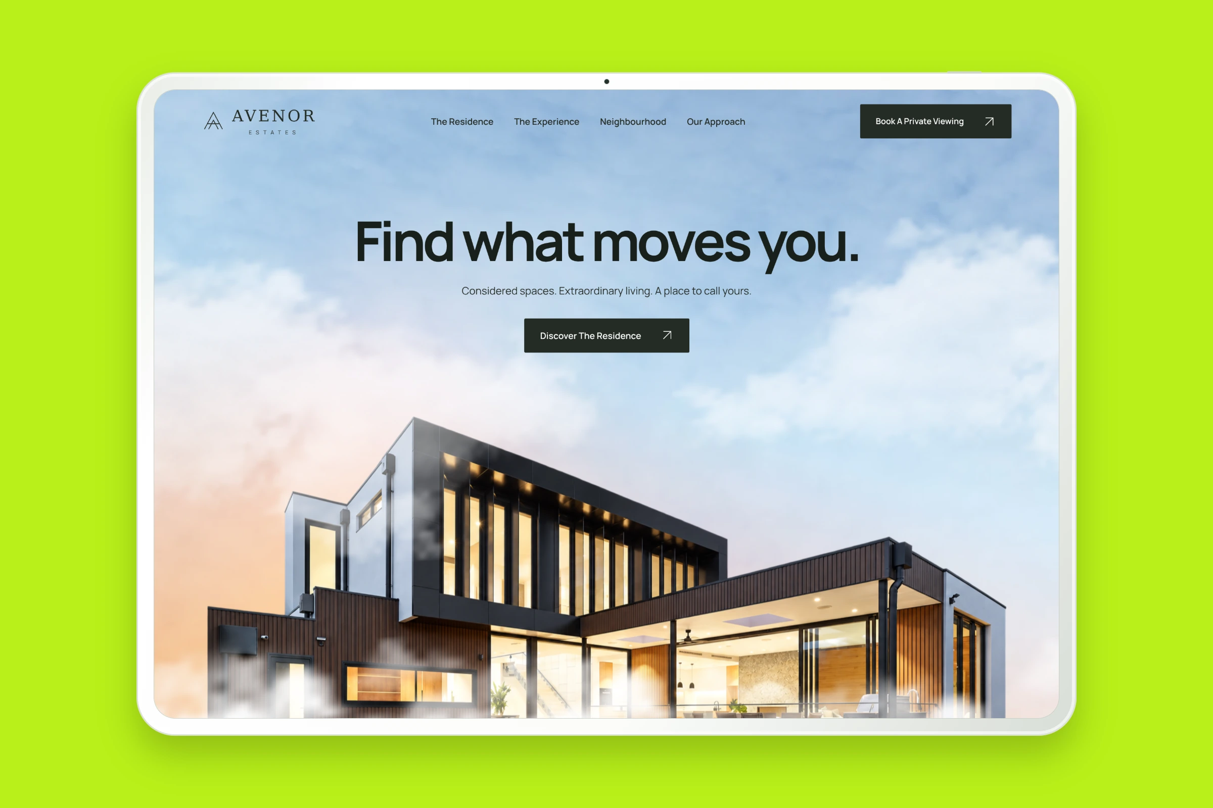
Architecture, residence details and interactive floor plans brought together in a considered property website.
Explore Case Study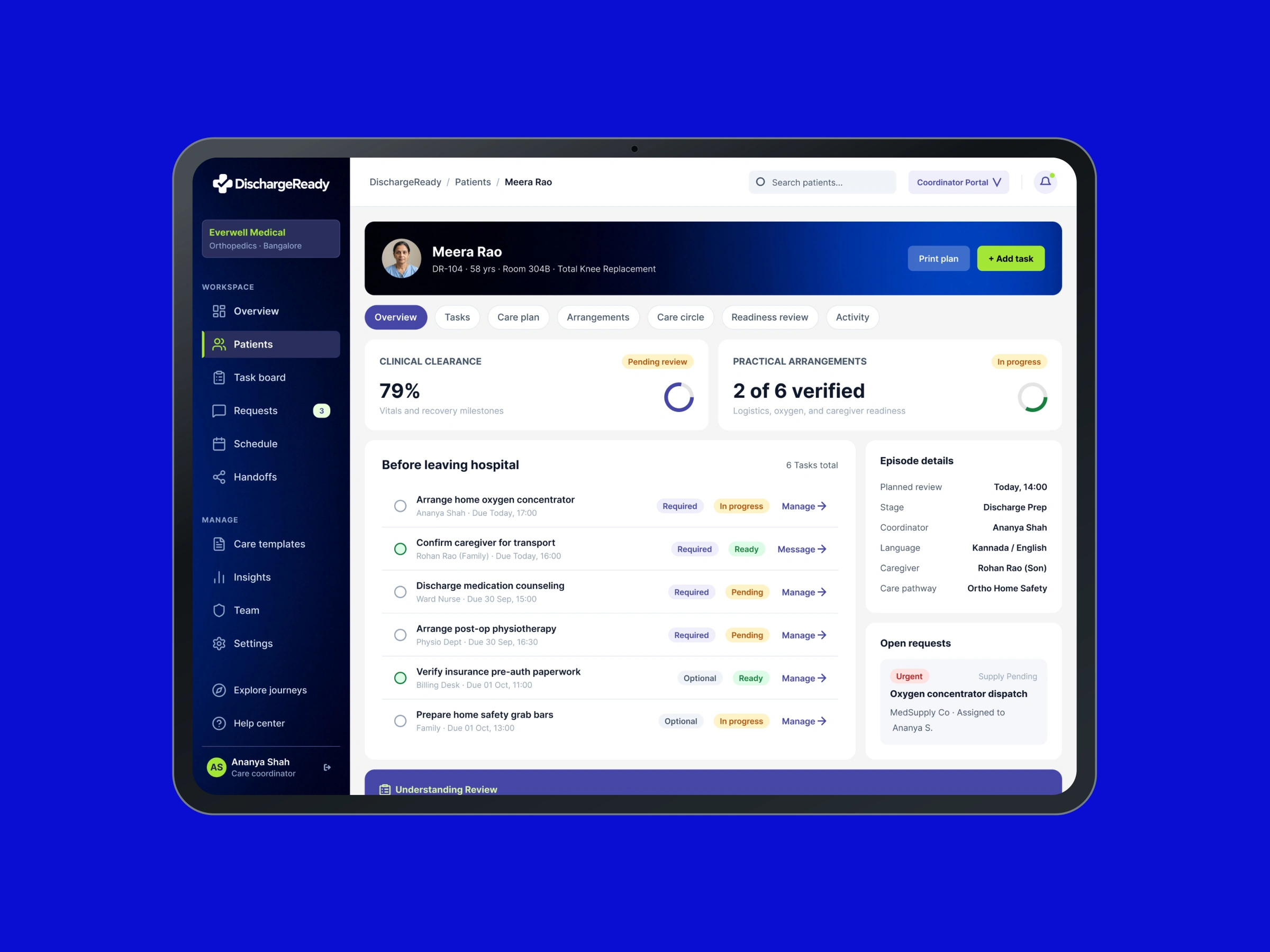
A shared view of discharge tasks, information and responsibilities for healthcare teams working across hand-offs.
Explore Case Study