
Make the options clear
Separate age groups, learning priorities and routines so parents can compare programs comfortably.
A playful preschool website that helps families discover the right program, picture the school day and plan a first visit. Warm photography and a friendly visual identity bring clarity and character to every step.
An independent preschool portfolio project designed around the decisions parents make before a first visit.
Help parents make sense of the practical details while getting a feel for the people, spaces and learning approach.
Separate age groups, learning priorities and routines so parents can compare programs comfortably.
Use a coherent visual story to show classrooms, outdoor spaces and everyday care.
Place a clear tour invitation throughout the page and end with a focused visit planner.
Design ObjectiveBalance the wonder of childhood with the clarity parents need.
Six connected moments move families from an initial impression to a closer look at life at Pip & Pebble.
An original flower identity, rounded typography and warm classroom photography introduce the school with a welcoming, distinctly playful voice. A persistent tour invitation keeps the next step easy to find.
Photographic cards distinguish infant, toddler and Pre-K programs with explicit age ranges, three focus areas and a schedule-and-details view. Families can understand the options before making an enquiry.
An interactive five-stage timeline connects arrival, stories, outdoor play, lunch and creative exploration to the moments that matter to parents. Keyboard navigation and a downloadable sample schedule support a closer look.
A large featured photograph and compact image selectors keep the campus easy to explore. Classrooms, reading nooks, gardens, art spaces and everyday facilities share a consistent visual direction.
A straight, softly rounded story card gives parent perspectives space. Manual controls, progress indicators and a pause button put families in charge of the slider. The preview identifies these stories as illustrative.
A warm invitation and custom schoolhouse artwork lead into a compact tour planner. Clear labels, native date selection and generously spaced dropdowns make the form comfortable to use. The preview saves a local visit plan without sending a booking.
A consistent set of visual and interaction rules keeps the page expressive and comfortable to navigate.
Fredoka gives the headlines personality. Nunito keeps labels, forms and body copy approachable.
Generated photographs share the same sunlit rooms, sage windows, peach arches and natural materials.
99px CTA corners, equal card radii and true circular pointers create a consistent visual language.
Subtle transitions, keyboard navigation and reduced-motion support keep interaction predictable.
A flower emblem, rounded typography and a gentle palette connect the identity to the website.
Rounded display lettering meets a clear, friendly text family.
Warm paper and deep indigo anchor coral, yellow, sage and pink accents.
Pill CTAs, circular icons, consistent cards and clean schoolhouse artwork repeat across the experience.
A responsive front-end experience with an original identity and connected interactions.
Custom flower logo, colour palette, rounded type system and original interface artwork.
Age-group details, a selectable daily timeline and a downloadable sample schedule.
Coordinated photography, interactive gallery, safety details and parent-story controls.
Desktop and mobile layouts, accessible controls, reduced motion and local tour planning.
Let’s create a website that reflects your organisation and helps people take the next step with confidence.
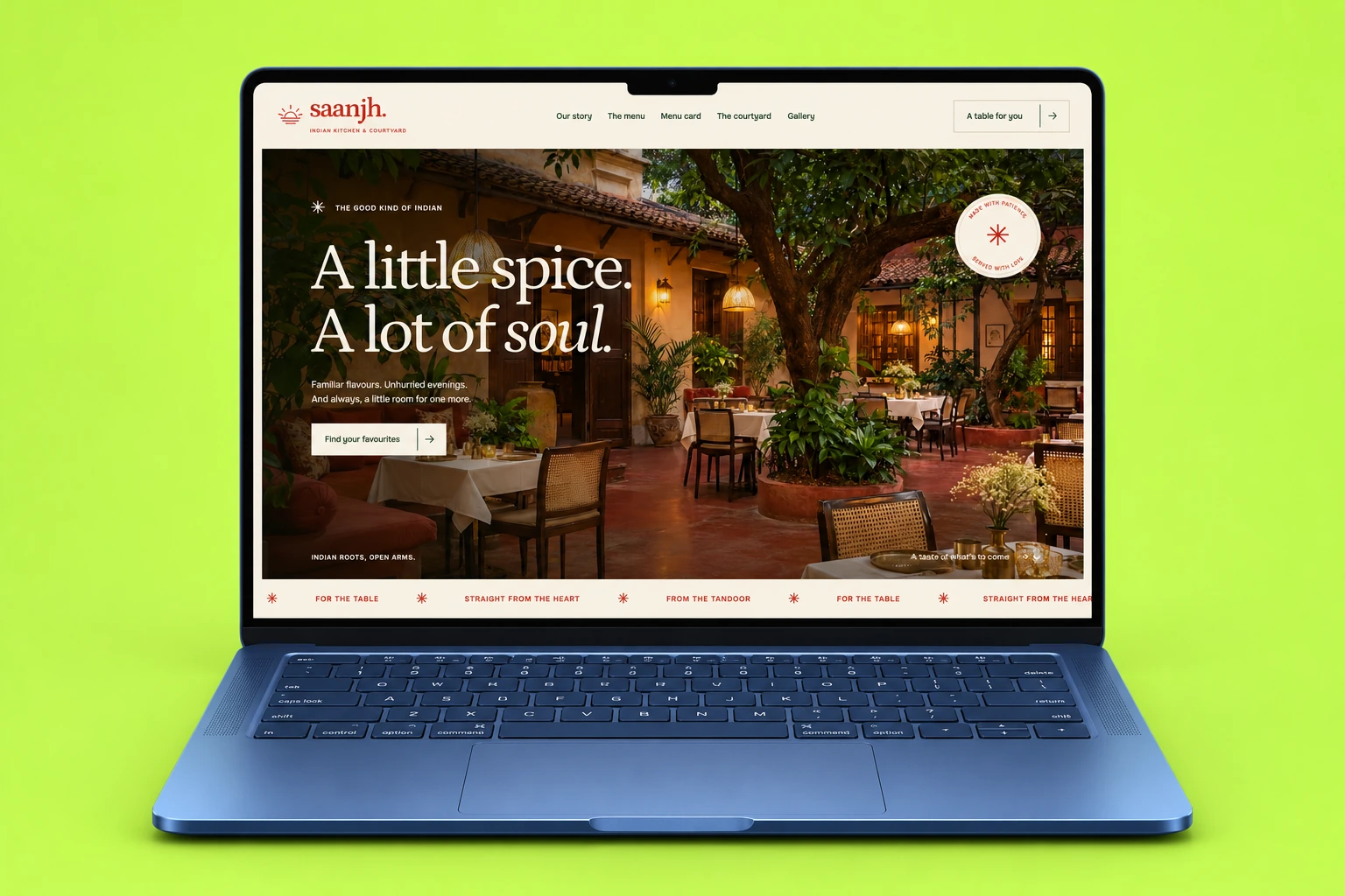
A warm Indian restaurant website with an interactive menu, immersive gallery and table planner.
Explore Case Study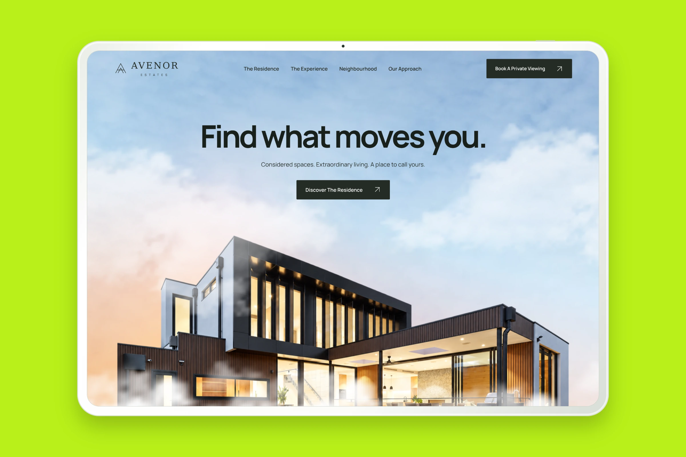
Architecture, residence details and interactive floor plans brought together in a considered property website.
Explore Case Study