
Make the first step obvious
Four clear categories introduce the essentials without asking people to understand a complex regimen.
A skincare storefront built around a calmer kind of discovery. Tactile product photography, considered categories and a simple routine finder help shoppers explore the shelf with clarity and confidence.
An independent skincare portfolio project connecting brand expression with practical ecommerce interactions.
Skincare shopping often begins with too many options. The challenge was to make the collection approachable while giving every product, texture and routine a distinct place.
Four clear categories introduce the essentials without asking people to understand a complex regimen.
Texture, size, price, ratings and cart controls stay together so shoppers can compare at a glance.
A consistent packaging system and warm photography bring the brand into every shopping moment.
Seven connected views bring the brand and shopping experience together.
A full-width still life introduces the collection, with calm copy and a clear path into shopping.
Circular product displays organise the shelf into Cleanse, Treat, Moisturise and Protect.
Category tabs, search, skin-preference filters, sorting and product details make the collection easier to explore. Cart buttons become quantity controls after adding an item.
Natural skin texture and a concise brand philosophy give the visual identity a warmer, more personal voice.
A connected three-step shelf brings cleansing, moisturising and protection together, supported by an interactive routine finder.
An edge-to-edge editorial image carries the brand message with readable overlay content and a direct shopping invitation.
Oversized brand typography, useful collection links and a routine invitation bring the experience to a considered close.
A small set of visual and interaction rules keeps the storefront coherent from first impression to cart.
Ivory, plum, citron and blush create a calm backdrop with a recognisable point of view.
Consistent packaging photography, circular category framing and generous spacing give each item room.
Outline buttons fill on hover and become plus/minus controls, keeping quantity changes in context.
A moving statement strip, subtle hover responses and reduced-motion support add character without hiding information.
A restrained wordmark, clear sans-serif UI and expressive serif accents connect the brand to the shopping experience.
A lowercase wordmark and open-circle motif keep the brand simple and recognisable.
Clean sans-serif labels work alongside italic serif moments in the larger editorial headings.
Matte packaging, natural skin, stone textures and warm window light hold the collection together.
A responsive front-end storefront with a coordinated visual identity and connected shopping interactions.
An original identity, consistent packaging visuals and editorial photography.
Four categories, search, sorting, preference filters, favourites and product-detail previews.
An interactive routine finder, persistent cart and inline quantity controls.
Desktop and mobile layouts, keyboard interaction and reduced-motion support.
Bring your brand, product range and customer journey together in one considered storefront.
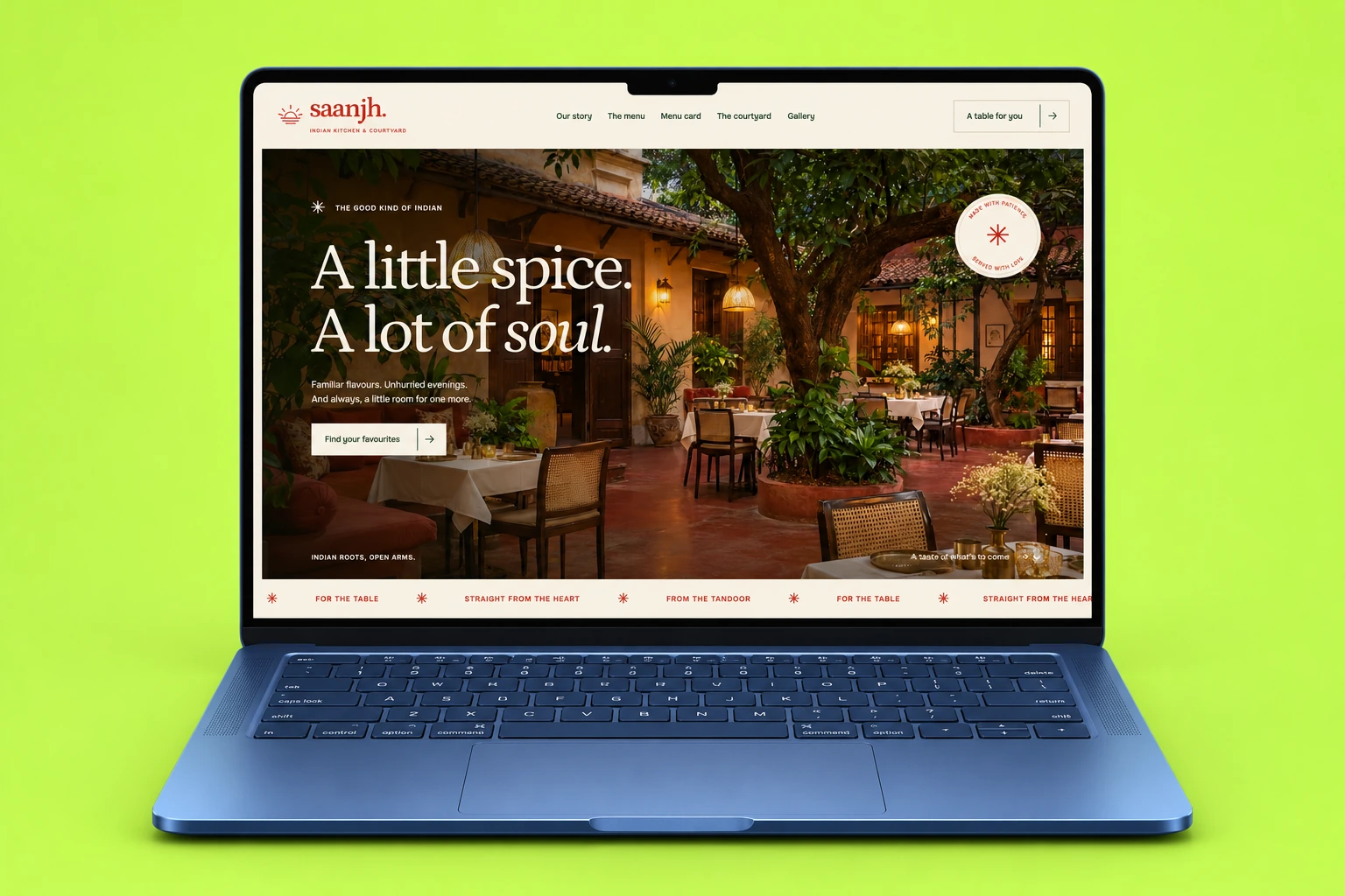
A warm Indian restaurant website with an interactive menu, immersive gallery and table planner.
Explore Case Study
Architecture, residence details and interactive floor plans brought together in a considered property website.
Explore Case Study