
Clear choices. Better discovery.
Filter by neighbourhood, property type and project stage. Compare configurations and areas, save a shortlist and open a project without losing your place.
A property developer experience that brings atmosphere and clarity together. Thoughtful search, architectural photography and an interactive estate tour help people find their next address.
A responsive developer website concept built around the way people explore property.
Property websites can make people work too hard to understand their options. This concept puts discovery, project information and the next step into one considered journey.
Filter by neighbourhood, property type and project stage. Compare configurations and areas, save a shortlist and open a project without losing your place.
Apartments, villas, plotted communities and workspaces each have a distinct starting point, with architectural icons and contextual image reveals.
An aerial estate map connects homes, the pool house, a garden pavilion and woodland walks. Select a marker to move the view and reveal more.
A restrained palette, editorial typography and generous photography balance atmosphere with useful information. Icons clarify each design principle.
A focused visit enquiry form creates a clear transition from browsing to a conversation, with a consistent visual hierarchy on desktop and mobile.
Deep coastal green, warm white and restrained typography frame a photography-led interface. Square controls and consistent icons keep key actions clear.
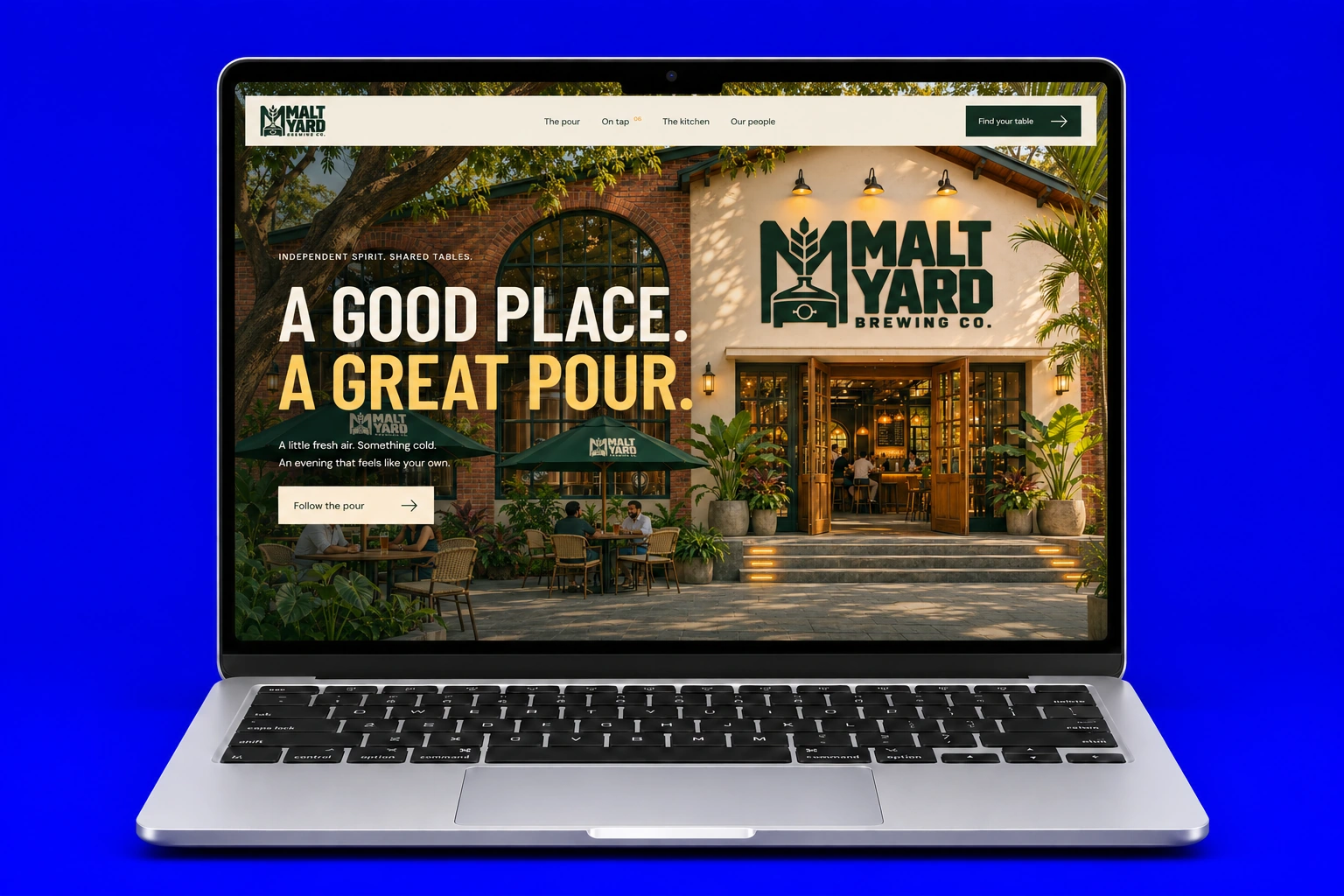
An immersive brewery experience with scroll storytelling, beer discovery and a tactile menu book.
Explore Case Study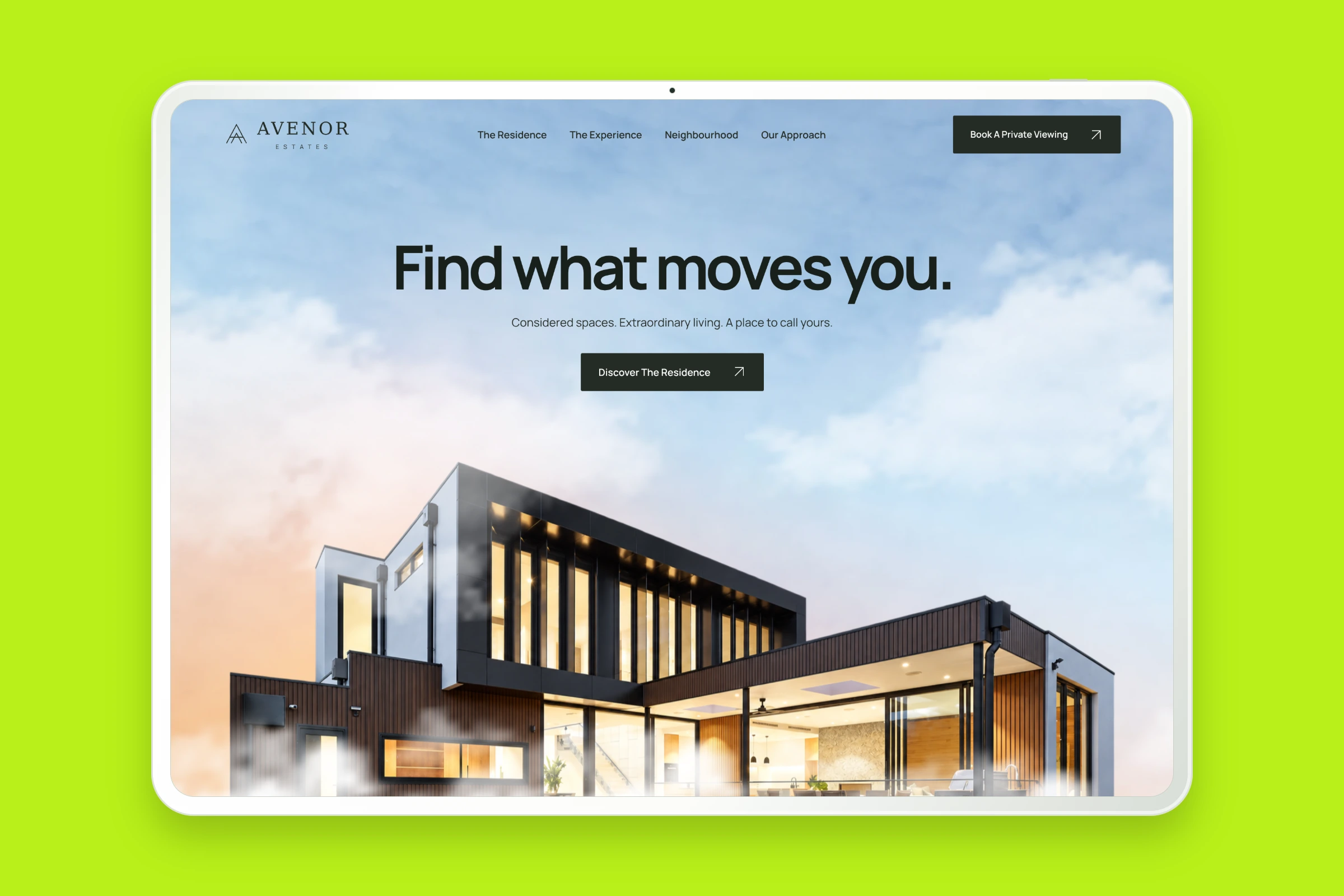
Architecture, residence details and interactive floor plans brought together in a considered property website.
Explore Case Study