
Lower the first-wave barrier
An inviting hero and encouraging, concise content make the school approachable without overwhelming new surfers.
A surf school experience that feels like being in the water. Bold typography, an animated ocean world and hands-on board discovery build energy around a clear path to the right session.
A complete surf school identity and responsive landing page, combining immersive motion with useful session and equipment information.
Help first-time and returning surfers picture the experience, compare rides and choose a suitable starting point.
An inviting hero and encouraging, concise content make the school approachable without overwhelming new surfers.
Shortboard, longboard and bodyboard discovery combines action photography with a hands-on 360-degree viewer.
Three lesson formats lead into session details and a focused form with the chosen session already selected.
Six connected moments turn a visual world into an experience visitors can explore, compare and act on.
An ocean-wide surfing image, a glass header and a gently floating headline establish the Bluehour world.
Moving water, detailed fish and swaying seagrass create an immersive backdrop with an optional ocean soundscape.
Large action photographs introduce shortboarding, longboarding and bodyboarding with a direct route to exploration.
Drag or use the keyboard to rotate each board through 360 degrees, revealing the deck, rails, underside and fins.
Three lesson cards use meaningful icons, clear inclusions and a filled middle CTA to support comparison.
A full-width surf lesson photograph and concise copy bring the people behind the experience into focus.
A distinctive underwater world is supported by readable layouts, practical controls and accessible ways to explore.
The translucent sticky navigation sits above the surfing image, keeping the rider framed within the hero.
The board viewer supports full rotation with pointer dragging, touch interaction and keyboard controls.
An explicit audio toggle enables a soft surf wash that responds to scrolling. Audio begins only after a visitor activates it.
Reduced-motion settings, a pause control, labeled form fields and keyboard-friendly controls support the visual experience.
Ocean blue, electric cyan and white define a sporty identity with angular headings, sharp controls and large visual moments.
A wave mark and condensed Bluehour wordmark connect the school to the movement of water.
Russo One creates sharp, expressive headings. Barlow Condensed supports the wordmark and labels; Archivo carries the practical details.
Coordinated Indian surf imagery, a deep-water backdrop and photographic marine details hold the visual direction together.
A responsive surf school landing page, original identity and interactive front-end, included with self-contained local assets for static hosting.
An original wave mark, sporty typography, consistent ocean colors and six coordinated portfolio shots.
Three board shapes with 360-degree drag rotation, keyboard controls and visible decks, rails and fins.
A floating headline, animated water, marine life, hover effects and an optional scroll-responsive surf soundscape.
Session details, preselected lesson choices and a downloadable enquiry summary. The form does not send messages or confirm bookings.
Connect your activity brand, people and customer journey in one distinctive website.
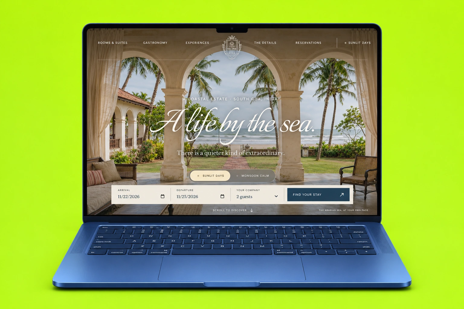
A coastal resort experience with immersive suites, clear amenities, thoughtful dining and a considered stay planner.
Explore Case Study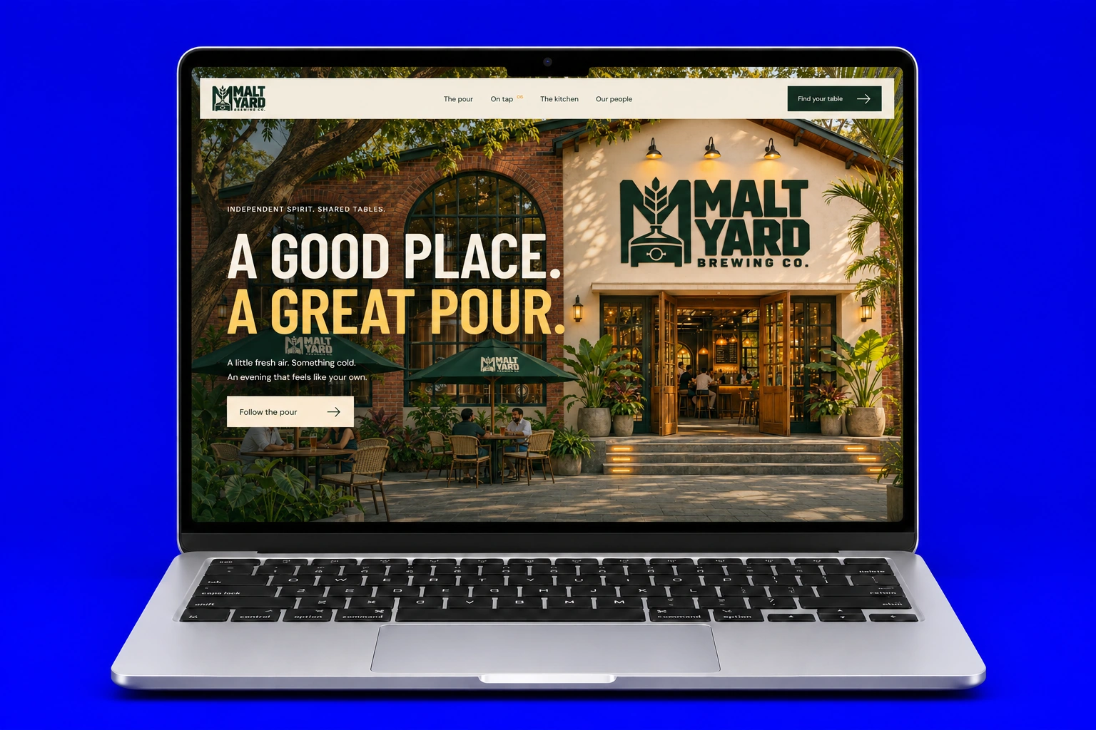
An immersive brewery experience with scroll storytelling, beer discovery and a tactile menu book.
Explore Case Study